Responsive Web Redesign for a non-profit organization
User Research- Style Guide- Usability Test- Hi-fi Prototyping reiteration


About this project
Locating CFGI, a non-profit organization that needed help, created clear mission statement and UX writing, to redesigned a responsive website in 2 weeks with a team of 4 designers
Result
Clear Mission Statement
Website complete reiteration and completed responsive website design, support mobile website.
Built an easy-to-understanding website which companies are willing to potentially sponsor talented international students
Tools
Adobe Illustrator
Figma
Google Form
Google Slides
Miro
Trello
User Research
What/Who is CFGI?
CFGI, Communication For Global Innovation, was founded by an immigration attorney and an international entrepreneur. Together they teamed up to create a non-profit organization this past June. Their mission is essentially to connect students that need sponsorship and companies that would “pledge” or commit to
sponsoring visas for talented international students.
Interview

We conducted 6 Zoom Interviews
1 poll (83 votes)
1 Survey (11 responses)
All of the people we interviewed were current foreigners studying or recent graduates who are or were
recently looking for employment
At this point, we still weren't sure what the main stressors were for international students when transitioning from academia to the workforce. We definitely needed more data
User's problem
After conducting our initial research we discovered two key pain points:
- International students have a high level of anxiety around finding a job, within 90 days, after they graduate.
-They feel a great deal of stress trying to understand which companies are willing to potentially sponsor international students.
Testing the original site
Objective
Does the website offer a clear message of who CFGI is and what services / product offering CFGI provides?
1. Find out what it means to take the pledge? Sign up to take a pledge?
2. Find out what you will actually do when you sign up to volunteer? What does "Volunteer" mean at CFGI? Then the user signs up to "volunteer" on the website.
3.. What is the criteria for sharing your story? Does anyone who shares their story get posted on the site? Why would you share your story? How do you share your story?
4. What does a sponsor do? Find out how to sponsor?
5. What does CFGI do and what product or services, if any, do they provide and to whom?
Test Result
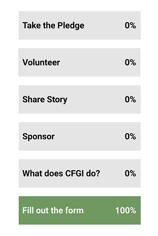
Users were unable to uncover what it meant to “Take the Pledge, Volunteer, Share their Story or to Sponsor.” However, 100% of testers were able to find and fill out the form for each category easily.


User Insight
What are the main blockers for users from understanding CFGI?
- Clear mission statement of the non-profit
- Easy to scan content and layout
- More content explaining:
a. volunteering duties
b. info on what it means to take the pledge and the level of commitment
c. how to donate and where the funds are going
d. clearer explanation who shares community stories
- More information about the movement so users know how to effectively promote it on social media
- The design is very nice, but I got lost because of the lack of content.
- Site needs language translation integration as it is targeting international students
User Persona
Bao Zang

Bao is a 27-year-old extrovert, pragmatic and detail oriented lady. She loves her family and speaks her parents via WeChat everyday.
She has a group of Chinese friends with similar hobbies like math, chess, and eats out. In her spare time she plays violin.
Goal:
- Find full time tech job in Silicon Valley
- Find a willing company to sponsor her
- Easy to access information
- Be part of a diverse community for support and networking
Pain Points:
- Unable to find visa sponsorship
- Feel anxious about her immigration and employment status
- Can't find any job boards that exclusively sponsor foreigners
- Miss her friends she makes here if forced to move back to China
Ideation
Lack of a clear mission statement and sufficient content are major issues of CFGI 's website. We started breaking the ground.
Information Architecture

Contents and flows are reconstructed for showing much clearer paths
Winner!
.jpg)
.jpg)
%20(1)_JPG.jpg)
_HEIC.png)
Sketching
Before moving forward to digital layout we started few sketches and decided to go for one of the best sketches.
Phototype

Digital Wireframe
Moved forward to digital wireframe. The mission statement is more visible and meaningful. Call to action buttons are also more prominent.
Lo-fi Prototyping
Lo-fi Prototyping is designed with the emphasis of Interaction Design.
Lo-fi Prototype Testing
Users tested some of the tasks for improvements and iterations.


Iteration
Users still weren't clear about what CFGI is with the Lo-fi prototype. We revised the content to be more clear.


Content in each card is more inspirational and call to action button works more effective.

Moodboard
My team and I looked at pictures that depict the mood of overlapping and connecting seemingly unrelated parts into an unified whole.

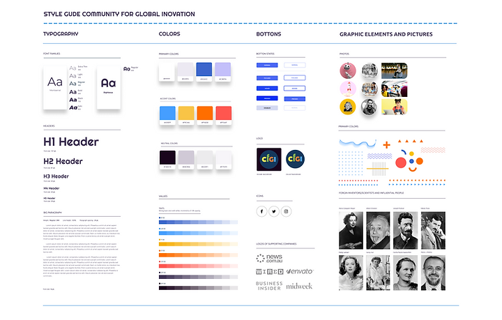
Style Guide
I was inspired by the mood board elements and notable foreigners.
While the website's target audience is college students and new grads, I added modern fonts, colors and playful images to match the audience.


Transitioning to Hi-fi Prototype
A visualized prototype is created. The eye-catching hero image and content attracted more attention.

Wait! Did Elon Musk ever endorse our movement?
Wait!! Did I ever?
Iteration
The process of the transition from Lo to Hi-fi prototype is amazing. However, we realized modern notable individuals shouldn't have been included in our web content due to the lack of endorsements.

