Incorporate Technology in the
Car Wash Business
User flow- Information Architecture- User Interface- Prototype- user testing
Shipped Progressive Web App redesign, Android app

Shipped
Aug 2022


Shipped
Dec 2022
Shipped
Jun 2022
Problem
The company launched its first iOS app back in 2018., but failed to succeed and the app was eventually pulled from the App Store. Why would the app be pulled? What are the UX issues?
Goal
Refine the information architecture, recreate a seamless user flow for car wash membership purchase, ideate and create brand new UI, along with the emphasis of accessibility and usability for returning user.
Value Proposition
Car wash membership is the primary product that drives the business with stable and predictable income.
The application allows user to inquiry the services we offer, the tools to locate our locations while on the road, and more importantly, provide features to retain new members.
UX Review
The original landing page contained references of "myQQ", but it gave user lack of ideas what it did with a car wash business.
The layout contained 5 unaligned options with 4 linking out to the pages of marketing website.

User was taken directly to account registration.
The success rate dropped 20% moving forward because of the forced registration. User had no idea about what to purchase before the commitment.


Lack of accessibility such as legibility and choice of color issues.
Confusing Call to action.

Redundant steps:
- 3 Prompts to ask user as new or existing member
- Add vehicle appeared on each step


User's journey was complexed.
It took 5-6 pages to complete a membership purchase.
Information Architecture

A new information architecture is created. The goal is to recreate the hierarchy, avoid any redundancies and simplify the purchase flow.
Products and Features
in production

.png)
A new landing page is created to build a bridge between the brand Quick Quack Car Wash and myQQ, the portal of myQQ member.
Original design (Responsive Web)

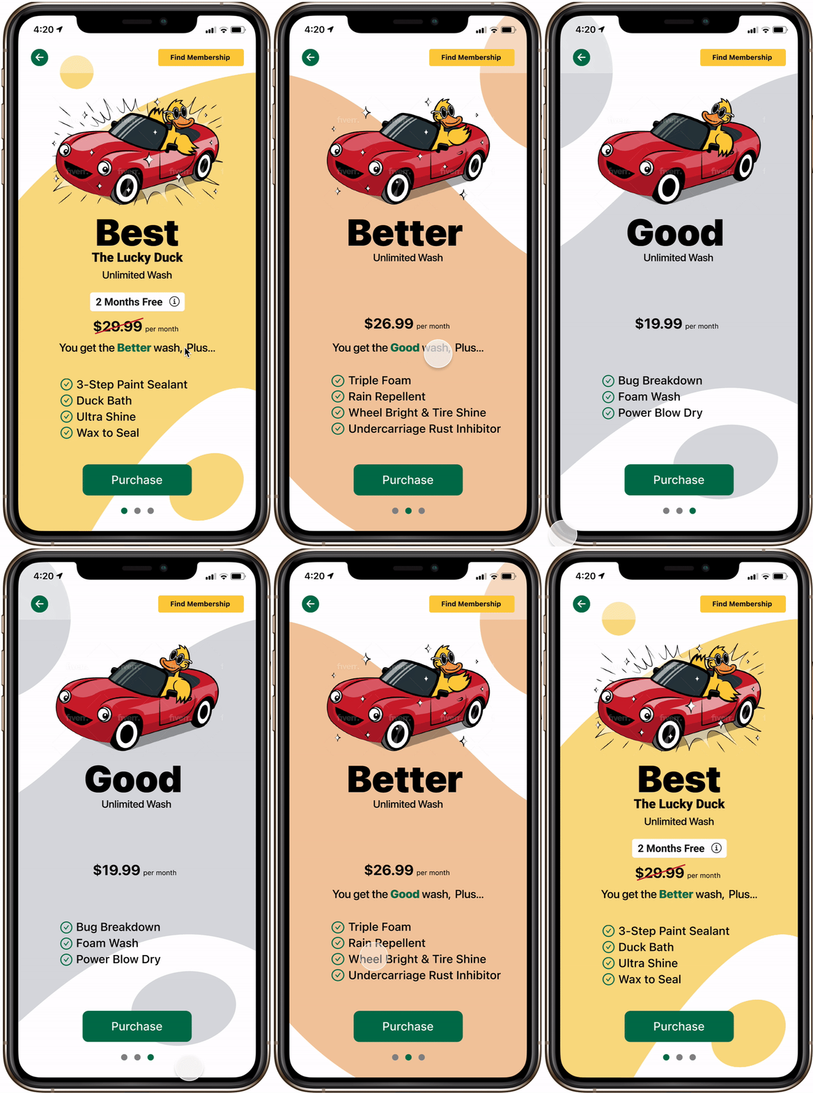
A single page, with the enhanced micro-interaction modals, allows user to complete membership purchases without going through page after page.
New design (PWA, Android, iOS)

New design (PWA Desktop)

Progressive Web with responsiveness allows engineers to work efficiently.
In addition, all of the master components are designed with the mindful of reusability.
Iteration
Plans on Desktop (MVP)
Plans on Desktop (MVP)
Plans on Desktop (MVP)

2-step Plans on iOS (MVP)


Iterated Plans on Desktop

Iterated Plans on iOS

Copy and tight timeline were provided prior to design on MVP.
After the initial launch, I partnered with the Marketing Team and we were able to edit the copy within the description on each plan.
As a result, a major design iteration was completed with the consistency of 1-page layout with shortened description.
Conclusion and next steps
Conclusion
Time constraint is the biggest challenge. I am the only UX designer on the team.
Therefore, my designs and time management directly impacted the fellow engineers.
Numbers of feedbacks and suggestions are provided and those will be considered
after the MVP.
On top of building a seamless user experience, I also listened to many stakeholders and their feedbacks.
Since the development team is not as established as notable high tech companies, we
as a team experienced high stress and challenges.
Production
Android, new designed PWA and iOS app have been shipped.
More features are being ideated:
Live updates of car wash traffic and weather, user's dashboard, car wash reminders and etc, will be coming up in later releases.

